Colors are an essential element in web design, and their role in the success of a website cannot be ignored. A website's color palette has a significant impact on its overall appeal, branding, and user experience. A poorly chosen color palette can result in a website that is unappealing and difficult to navigate. Yet, a well-chosen color palette can improve the website's aesthetic appeal, make it more memorable, and enhance the user experience. In this article, we will discuss the role of color in web design and how to choose the right palette for your website.
The Psychology of Colors in Web Design
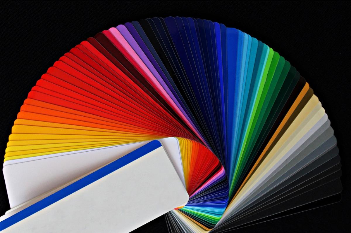
The psychology of colors refers to how different colors affect human behavior and emotions. Colors can evoke different emotions and feelings in people, and this is why they are so important in web design. For instance, blue is associated with trust and reliability, while red is associated with passion and excitement. Therefore, it is essential to understand the psychology of colors before choosing a color palette for your website.
How to Choose the Right Color Palette for Your Website
When choosing a color palette for your website, there are several factors to consider, including the nature of your business, target audience, and the emotions you want to evoke. Here are some tips on how to choose the right color palette for your website.
Determine the nature of your business.
The nature of your business should influence the color palette you choose. For example, if you're in the healthcare industry, you may want to use blue as it's associated with trust, reliability, and calmness. If you're in the fashion industry, you may want to use more vibrant colors that are associated with excitement, such as red or yellow.
Consider your target audience.
Your target audience should also influence the color palette you choose. If you're targeting a younger audience, you may want to use bright and bold colors that are associated with energy and excitement. If you're targeting an older audience, you may want to use more subdued colors that are associated with sophistication and elegance.
Use a color wheel.
A color wheel can help you choose complementary colors that work well together. There are various color wheel tools available online that can help you choose a color palette that works well together.
Best Practices for Using Color in Web Design
Now that you understand the psychology of colors and how to choose the right color palette for your website, here are some best practices for using color in web design.
Limit your color palette.
It's important to limit your color palette to three to five colors. Using too many colors can be overwhelming and distract from the website's message.
Use contrast.
Using contrast can help draw attention to essential elements on your website, such as calls to action. For instance, using a bright color for a call to action button can help it stand out.
Be consistent.
It's important to be consistent with your color palette throughout your website. This helps to create a cohesive look and feel and enhances the user experience.
Conclusion
In conclusion, color is an essential element in web design, and its role in the success of a website cannot be ignored. Choosing the right color palette for your website can improve its aesthetic appeal, make it more memorable, and enhance the user experience. When choosing a color palette, it's essential to consider the nature of your business, target audience, and the emotions you want to evoke. By following the best practices for using color in web design, you can create a website that is visually appealing, memorable, and user-friendly.
The Appeal Design is full service Atlanta based web design and marketing company. We provide a large variety of design services including corporate brand identity, Atlanta web design and development, online marketing services, print services, and graphic design. We benchmark our services against what we see are the best in the web design industry, seeking inspiration and educating ourselves on trends from around the world.
FAQs
How can I ensure my website's color scheme is accessible for users with color vision deficiencies?
You can use online tools such as Color Contrast Analyzers to check the contrast between colors and ensure that users with color vision deficiencies can still read and navigate your website.
Can changing the color scheme of my website improve my search engine optimization (SEO)?
While color alone may not directly impact SEO, using contrasting colors can improve readability and user engagement, which can indirectly improve SEO. Additionally, using a consistent color scheme throughout your website can help with branding and recognition, which can also benefit SEO.
How often should I update my website's color scheme?
It's not necessary to update your website's color scheme frequently, but it's a clever idea to periodically assess whether your color scheme still aligns with your brand and audience. If your website starts to look outdated or your target audience changes, it may be time to update your color scheme.